The screen at a glance
Almost everything lives in one bar across the top. There is no side menu.
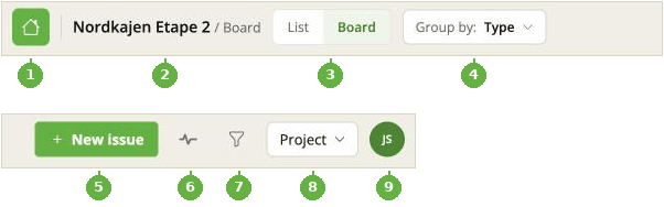
The bar, split into two rows so it fits: its left-hand end above, its right-hand end below.
-
Home - the house icon on the far left. Takes you back to the list of projects.
-
Where you are - the project name, and whether you are looking at the List or the Board.
-
List / Board - switch between the two views of the same issues.
-
Group by - only appears on the board. Decides what the columns are: Status, Assignee, Type, Milestone, Priority or Custom ordering. See Board view and grouping.
-
New issue - the green button. Present on every screen size, because it is the thing you do most.
-
Activity - the heartbeat icon. Drops open the five newest things that happened, with a link to the full feed. See Activity.
-
Filter - the funnel. Search, filters, which columns are visible, and sorting. See Filters, search and sorting.
-
Project - a menu with Edit project, Collaborators, Export and Import. Edit project and Collaborators only appear if you own the project.
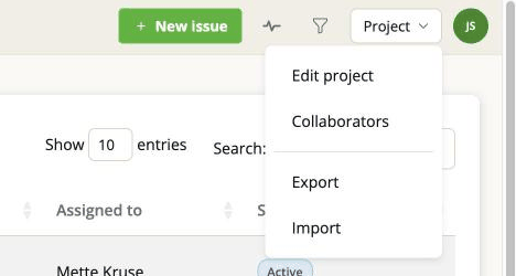
-
Your initials - Profile and Log out.
On a phone
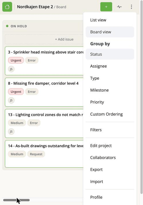
The same items, gathered behind the three dots on the right: list and board, filters, the project settings if you own it, and import and export. Group by appears in the same menu when you are on the board. The heartbeat icon stays visible at every size.
New issue stays visible as its own button - as an icon rather than with its label.
The two views
The List is a table. Good for scanning a lot of issues, sorting by a column, and seeing many fields at once.
The Board is cards in columns. Good for seeing where work is standing still, and for changing something by dragging it.
They show the same issues and the same filters apply to both.
Opening a project from the projects overview always starts you on the List. But the app does remember which view - and which board - you were last on, and takes you back there when you come out of a sub-page: after editing the project, after creating or deleting an issue, after an import or export, or from the collaborators page.
Opening an issue
Clicking a row in the list or a card on the board opens the issue in a panel that slides in from the right. There is a full-screen toggle if the panel feels cramped, and a close button to get back.
The rest of the project stays behind the panel, so you keep your place.